

Clusters, counts and tooltips that convey real information
Standard clustering algorithms combined with drill-down widgets are great tools to navigate maps densely packed with markers. But these are not great informational tools. In fact, standard clustering may drive your customers to the wrong region. In four paragraphs, learn about the problem and a solution ready for you to download.
1. Why cluster?
First things first. Just in case you have been off the map, living under a rock in some dark place and wonder why maps must have marker clustering, have a look at the image on the left. Need we say more? Good luck panning and zooming to find that waffle stand in Belgium…
Yeah, UX = 0.
2. The old way to cluster
So it will come as no surprise that one of our favourite Javascript plugins to have come out recently is danzel's Leaflet MarkerCluster code.
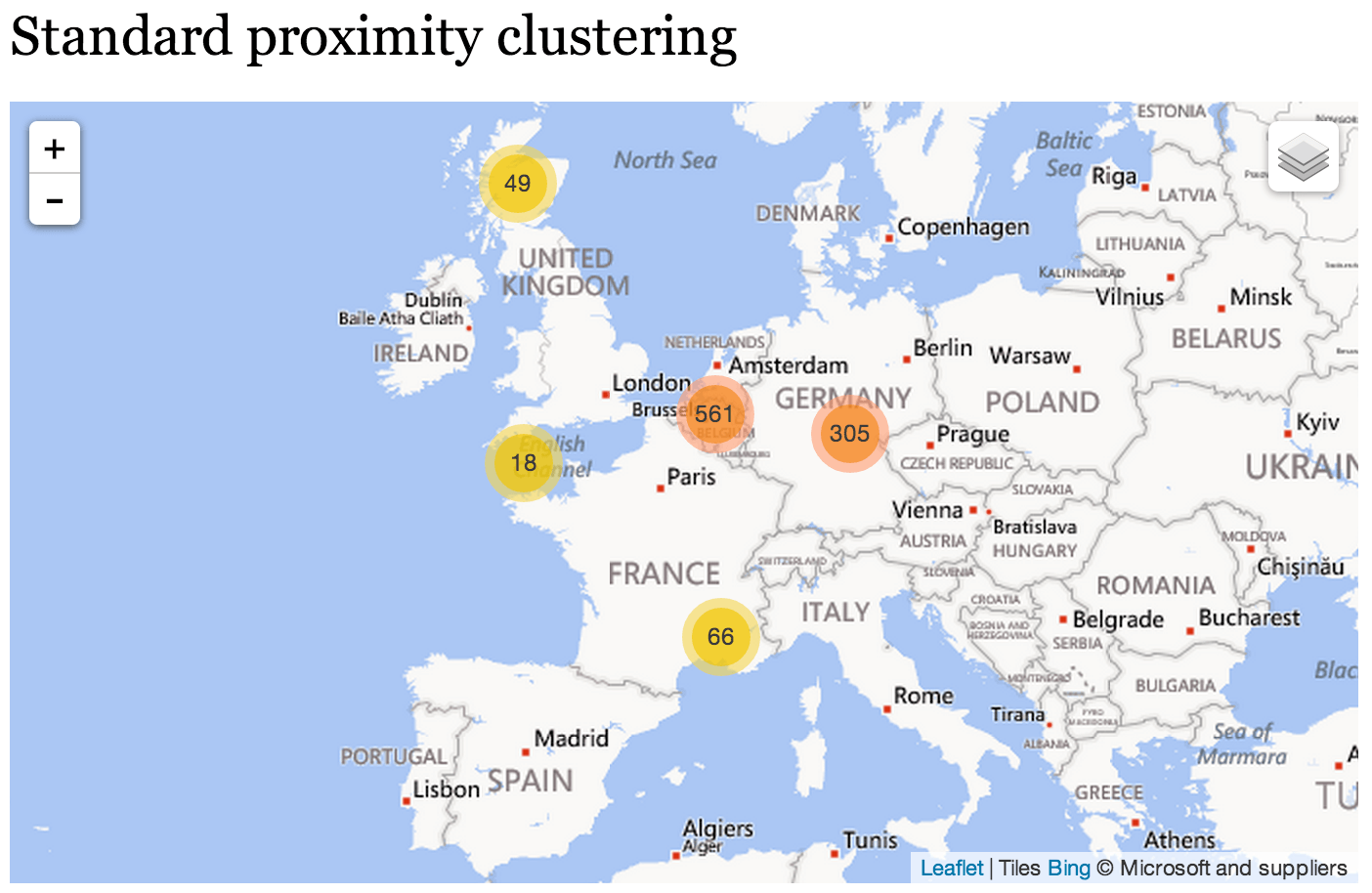
See what it does to the above map in the "Standard proximity clustering" image below. It beautifully subdivides that mass, or should we say mess, of some 1000 markers across 6 countries (UK, Netherlands, Belgium, France, Germany, Switzerland) into handy cluster circles that you can drill down into for details.
Works a treat. It is for good reasons that this clustering algorithm graces thousands of sites across the world.
 |
 |
3. The snag
Imagine for now these clusters and counts represent business opportunities. Whether you are a buyer or a seller, those coloured dots constitute the honey you're after.
So where would you drill to next? Probably to that 561 cluster over Belgium, right?
That, it seems, is where all the action is. Switzerland appears to have nothing going on at all.
But you would be wrong.
4. The new way to cluster
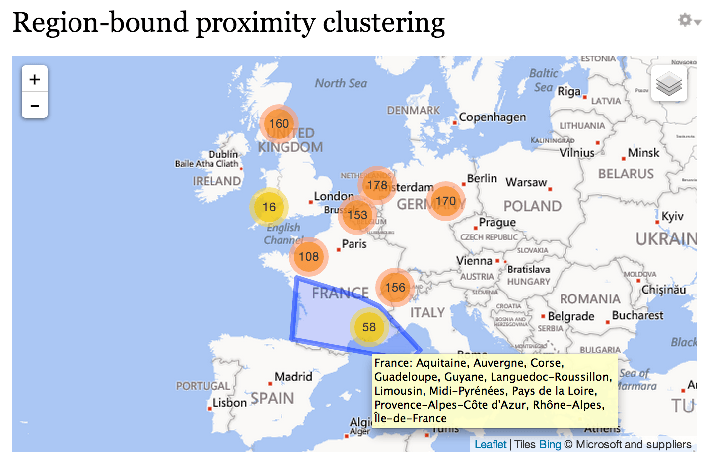
Have a look at this next screenshot, a map built from the same data. But this time our RegionBound plugin drove the clustering.
Waking up to reality you'll find that Switzerland with 156 is doing quite alright, thank you very much. And Belgium with 153, isn't so hot after all.
It is the same data. Were you duped by the first map?
I guess you were. It's because the original plugin is only proximity-aware whereas the second one is also region-aware. In fact, it is region-hierarchy aware: it knows the world is made up of countries, then states/provinces, then cities, then suburbs. And it honours their borders.
So it puts the clusters and the counts where they belong: inside the countries. One count each for Belgium, The Netherlands, Germany and Switzerland, two for the larger countries of France and the UK. Previously cluster counts merely totalled how many locations they were hiding in a random area crossing multiple borders – that's not meaningful. Now the counts accurately reveal something about each region and do not skew your customers' perceptions of the data.
Note too, how the plugin extension produces handy hover tooltips that show the name of the region (in this case, the country) and all its populated subregions.
Pretty snazzy, eh?![]()